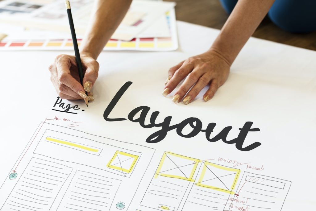
Content vs. design: the never-ending debate of which is more important when creating a website. Let’s think about it for a quick second; why do people visit websites? In most cases, the main reason behind each visit is to read about certain content they want to be more informed about. Now, the thing is, while the way in which content is written is significant, the way in which this content is presented and designed is just as important. The reason? Well, even if the content is written in the most unique, creative, and informative way, if it’s not visually appealing, it’s not going to attract anyone to read through it. That’s why one of the first things designers do when they take on a website project is deciding on an attractive yet informative website layout. Have you ever noticed how the majority of the top websites resemble each other in design but differ in content? That’s because these layouts have significant advantages: they’re user-friendly, they’re familiar, and they save so much money and time for the designer. There are so many different website layout designs out there, but some just never go out of style.
Single Column
Regardless of its simple and basic design, the single-column layout has grown significantly in popularity due to the growth of the mobile web and mobile-friendliness compatibility. The great thing about a single column is that the same layout can be used on mobiles, tablets, and desktops which saves time and reduces costs and that it creates a great reading experience since the focus is on the content and there are minimum distractions around it. When combined with images and visuals, a single-column layout allows these images to shine and create a powerful impact. However, certain downsides of using this layout are that due to the long-form, the content and information present on the website can give the users an idea that there’s no more information below the fold. This type of layout is typically used in personal blogs like Tumblr or online reading platforms such as Wattpad.
Featured Image
One of the most effective website layout designs is the featured image layout. With this layout, one big powerful featured image is presented to create a stunning first impression and make a powerful and strong statement. The featured image layout is based on the idea that one big, bold image can create an emotional connection and is a fast way to get people to buy the product. This layout is not typically used for explanation and lots of content to be presented on your main page. One of the many companies that use this layout on their websites is Apple which presents a large background image, a title, and a description. As simple as it is, it focuses the user’s entire focus on it and demonstrates the newest products that have been launched. This layout can work wonders by building a truly mesmerizing and emotional experience, and with a great call to action, it can increase your sales numbers by a lot!
Split Screen
The split-screen layout is when the screen is divided into two, and this website layout design is excellent for a page with two pieces of content that have equal importance and grab attention when users first arrive at the website’s home page. In this case, the website demonstrates two different areas of the business or two binary choices from which the users can choose from. This website layout is a relatively limited option. There are few scenarios for it to be used; however, it can be beneficial and visually attractive when used correctly.
Magazine
As its name implies, this type of website layout design is used in news or magazine websites to portray a large number of stories. While this layout does a great job at summarizing the stories and news using headlines and images, it also has its disadvantages. Users might get overwhelmed and confused due to the massive amounts of posts to navigate; however, this problem can be easily solved based on the designer’s ability to simplify and clarify the overall structure. For example, Vogue magazine usually makes the website’s left-hand image larger than the rest to emphasize and focus the attention on it; this will tell the readers where to look first. So, make sure that if you are to use this layout for your website, you work on a simple design that is easy to navigate and won’t lead to frustration.
Asymmetrical
The asymmetrical website layout design is similar to that of the split-screen format, whereby they both include splitting the screen into sections and layouts. Still, the difference here lies in the way in which they are separated. While split-screen involves splitting the homepage into two sections parted at the middle, asymmetrical usually means that the screen is divided into several sections. The advantage of the asymmetrical layout over the split-screen is that you will emphasize and focus on a specific area you desire by making it appear bigger with more powerful headlines. In many ways, this layout is an excellent option to be used as it is flexible, easy on the eyes, and user-friendly.
To choose the right layout for your website, try taking a look at some of your competitors’ layouts and how they design their websites and see if you can get inspired to select the right layout for your business. Of course, don’t copy-paste the website; just get a little inspiration and some ideas on how you should go. Also, keep in mind your audience and the type of business and make sure that the layout you choose works with that.
